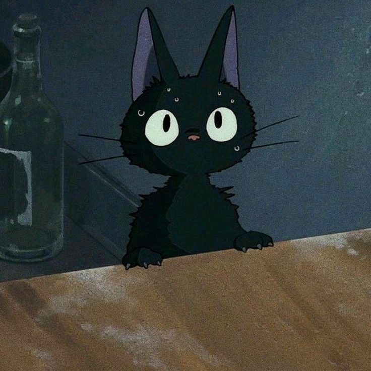

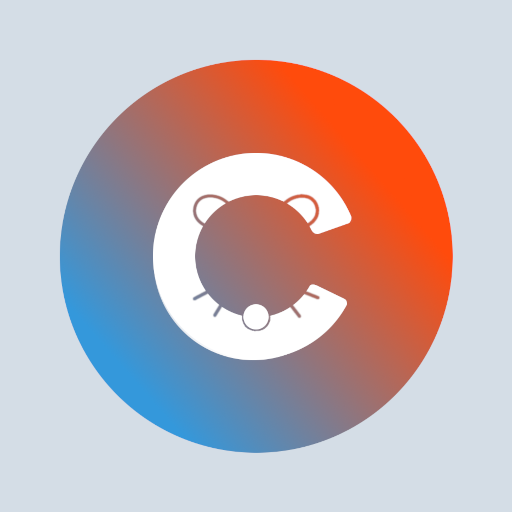
The details such as ears, whiskers, nose are way too small. They’re hardly recognisable on a mobile device, app icon wise.
I love the app but the new icon / logo not so much.
100% agree. I really enjoy the app and Kuro has done amazing work, but this logo misses the mark tbh. I’m definitely no graphics designer (just someone who knows enough to make shitty memes), but the alignment is all over the place with this logo.
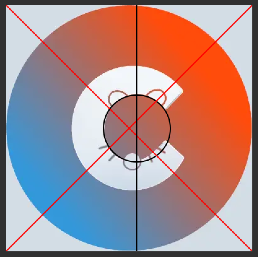
If it were centered it would be offcenter
As a graphic designer I do agree. If the makers of the Connect app wish I’d be more than willing to help them with a new logo. It’s not a bad concept per se, just needs some better execution
Hi, I’ll send you a message!
I personally dislike the ears and whiskers a lot. Not sure why exactly, I just really hate it. To the point that it’s no longer on my home screen. I may even look for other apps. It’s bizarre that it bothers me this much, but it really does.
I think its because from a distance the ears and whiskers just look like glitched pixels or something. When i first saw it i thought something was up with my screen for a hot sec
The new update RULES. The UI is just souch more polished and I love the blue implementation for NSFW (in lieu of bright red call-out). Also you implemented the tap to u hide and tap again to rehide! THAT WAS MY FAVORITE FEATURE some other apps had!
Connect has beeny fave since I found it and it just keeps getting better, thanks so much.
Congrats! I really appreciate how responsive and attentive you are with the community, pumping out fixes and feature updates basically on the fly. I don’t mean to simp, but I just want you to know it doesn’t go unnoticed, even if some of us are consistently posting about something. 😅
Honestly, the old app logo was better. This doesn’t look professional.
This. The new logo looks horrible!
The idea is nice, but the execution is awful. E.g. why is the center of the C so skewed?
I hope it’s not some situation where the Devs girlfriend created it, and he doesn’t want to change it because of that and we will be really stuck with this… ruining the app a bit.
Haha, I have no one to blame but myself unfortunately! I did make a change to the inner circle of the C making it less skewed based on all the feedback.
I was kind of surprised by the logo after the update, as it looks very similar to the Covid warn app from Germany: https://www.coronawarn.app/de/
Doing great! Also love the new logo.


