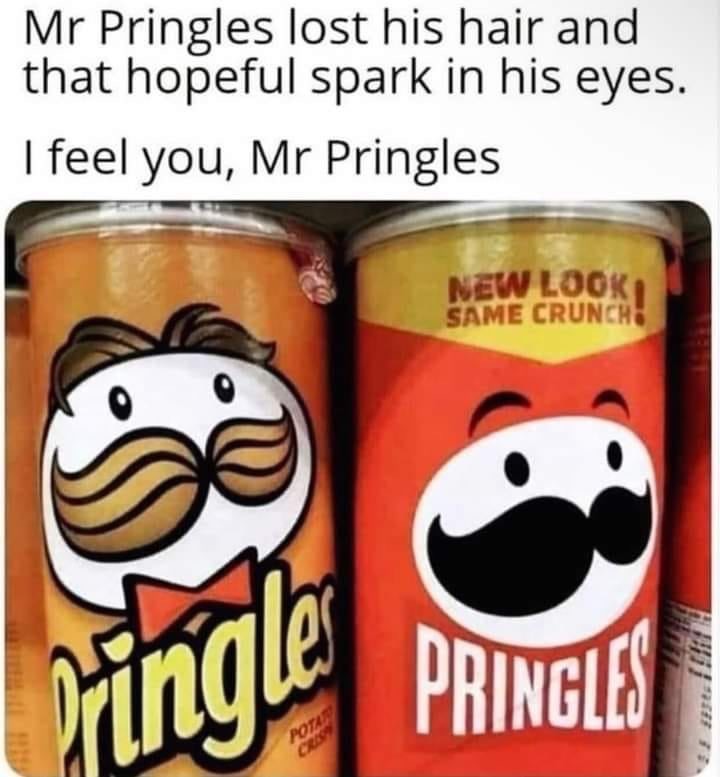
It’s notably a shift toward iconography in an effort to make it look more modern. These simpler vector designs can also be more easily used at smaller sizes
.
It’s mostly because people consume most content via apps and the web on smart phones now that have screens that are anywhere from 4.5" - 6.5" in size, and sadly more complex logos just don’t look that good when they’re squished into an area that’s a fraction of the total screen size. Where as in the past people might see a Pringles ad or anything related to Pringles on the TV, in a news paper, on a billboard etc which have way more space so the details are visible.
It is pretty unfortunate though, it’s the same reason the Firefox logo (and like everything else lol) was made minimalistic. I miss the old Firefox logo, I didn’t use Firefox in 2005-2009 but that one is definitely my favourite, the 2009-2013 one is nice too though which is when I first started using FF I think. Compared to today’s logo even the 2013-2017 one is great though
Ya. I run a print shop, and you’d be surprised how much ink consumption increases cost. Not to mention which colours are used. You need to use multiple colours of ink in specific ratios to create other colours.

The flat design saves ink and lowers costs. Anything to save a penny and increase profits.
It’s more that corporates are brainwashed into thinking vector and minimalist art is more beneficial.
Next version will just be a white oval.
It’s notably a shift toward iconography in an effort to make it look more modern. These simpler vector designs can also be more easily used at smaller sizes .
.
That’s a good point.
Easier to work with as well. They can easily outsource slight variations of the logo (for example Mr. Pringles wearing gaming headset) when necessary.
It’s mostly because people consume most content via apps and the web on smart phones now that have screens that are anywhere from 4.5" - 6.5" in size, and sadly more complex logos just don’t look that good when they’re squished into an area that’s a fraction of the total screen size. Where as in the past people might see a Pringles ad or anything related to Pringles on the TV, in a news paper, on a billboard etc which have way more space so the details are visible.
It is pretty unfortunate though, it’s the same reason the Firefox logo (and like everything else lol) was made minimalistic. I miss the old Firefox logo, I didn’t use Firefox in 2005-2009 but that one is definitely my favourite, the 2009-2013 one is nice too though which is when I first started using FF I think. Compared to today’s logo even the 2013-2017 one is great though
Maybe the savings are going into more chips and/or quality?
Hahahahahaha!!!
No man, it’s going into the shareholders’ pockets. That’s the whole point of capitalism. That’s the basic rule of the game.
Are they really charged by how much ink they use though? I would have thought cost was a per unit.
Ya. I run a print shop, and you’d be surprised how much ink consumption increases cost. Not to mention which colours are used. You need to use multiple colours of ink in specific ratios to create other colours.