Why the fuck is a page about fonts using 50% CPU?! Is it mining crypto or something?
Average website experience in 2023
That’s just modern web dev
I really hope Chrome gets its shit together and stabilizes the chrome.processes API during my lifetime so I or someone can make an extension that autokills or at least warns you about these shitty pages.
And sadly one more font I will never be able to use due to missing support of non-latin characters.
Sadly some features are nice.
Technically, font healing is a neat idea. It fails for text that does not meat its requirements, i.e. two ‘m’ next to each other. Depending on the characters around them, this might create two different ‘m’.

This is unavoidable, of course. The only solution are proportional fonts. So font healing is a nice idea. It creates a more consistent spacing at the price of less consistent glyphs. Whether one likes this compromise, is a matter of taste. I personally lean towards consistent glyphs, but I did not try it for an extended period.
Ideally, texture healing would distribute the resizing over the whole word, so it would look better and be used in more cases. But that is not possible with OpenType fonts as far as I know.
Commit Mono has smart kerning, which is similar, but it only shifts, not morphs, the shapes. So it avoids that the same letter looks differently in different places. It also works on triplets, not just pairs, so it is more widely applicable. See this comparison.
I’m not sure I’d consider that “failing”. At first glance, I don’t mind the distinct “m” glyphs being juxtaposed. But perhaps I’d find it annoying after a while.
Maybe ‘failing’ is too strong. What I mean is that in situations like the one I showed, texture healing cannot solve the problem of uneven texture. Not that they claimed it does. It just eases the problem. I like to know the trade-offs. When does it provide an improvement and when not? What tensions does that create?
From a users point of view, I do not know if it ‘fails’ or not. I totally agree with you. Maybe the I would find to distinct ‘m’ glyphs annoying, maybe not. And example emphasizes the ‘problem’. Maybe, I woukd even notice while coding or writing. To know that, I need to try. I just like to know the trade-offs in advance.
When reading the announcement post, I was indeed hoping they’d include an example word with two "m"s in a row, so I was glad to see the example here. I don’t mind it, but it does feel almost dishonest to exclude that case from their post.
Yeah, I am always happy if a project not only mentions where it shines but also where it does not. But it is common practice not to do so. Same in academic publishing. Everybody is focused on selling oneself, it seems.
I love the idea of using multiple font faces at the same time while looking at code. I wonder if (hope?) terminals will one day soon support switching fonts with control sequences… Would be pretty awesome!
Looks nice, I’ll try it today and see how it goes. At least MS doing something good for a change…unless they added spyware to a font!? LOL
it’s free until they decide it isn’t
The only font I’m interested in for Code is one that has ligatures. Otherwise I’m fine with whatever.
What do you like about ligatures? I disable them straight away. To me it just seems to add an unnecessary level of complexity to the experience
I like the way they look. It makes the code more pleasant to read for me.
That texture healing looks super nice. Is that something fonts can just do or does it require special editor support?
It’s basically a different type of ligature - it is standard to OTF fonts, but requires ligature support in your editor/terminal. Just need to enable ligatures and/or enable specific ligature sets. See https://github.com/githubnext/monaspace#editors or maybe https://wezfurlong.org/wezterm/config/font-shaping.html for the general procedure in a supporting terminal.
Is there a way to disable it but keep ligatures?
From https://github.com/githubnext/monaspace#editors :
If you want coding ligatures but do not want texture healing, you can omit the
caltsetting:Thank you!
The fonts are nice but I absolutely hate the “copilot voice” text moving around idea, it’s absolutely terrible to read.
I don’t think the intention is that Copilot voice would be animated, I think they just had a dumb idea to highlight it that way in the demo. Look closely, and you’ll see the Copilot voice is the only text there written in the “Krypton” font. The animation indeed looks godawful.
Hmm nothing really jumped out at me at first glance, I don’t mind the ligature stuff, but also love monospace for the aesthetic.
But I am glad they’re experimenting with this stuff. Ive always wanted a sarcastica font, we’re almost there with sArCAsm. But it’s a pain to write :)
Holy shit, I never even thought to do something like this. Hahaha. I’m gonna try it later.
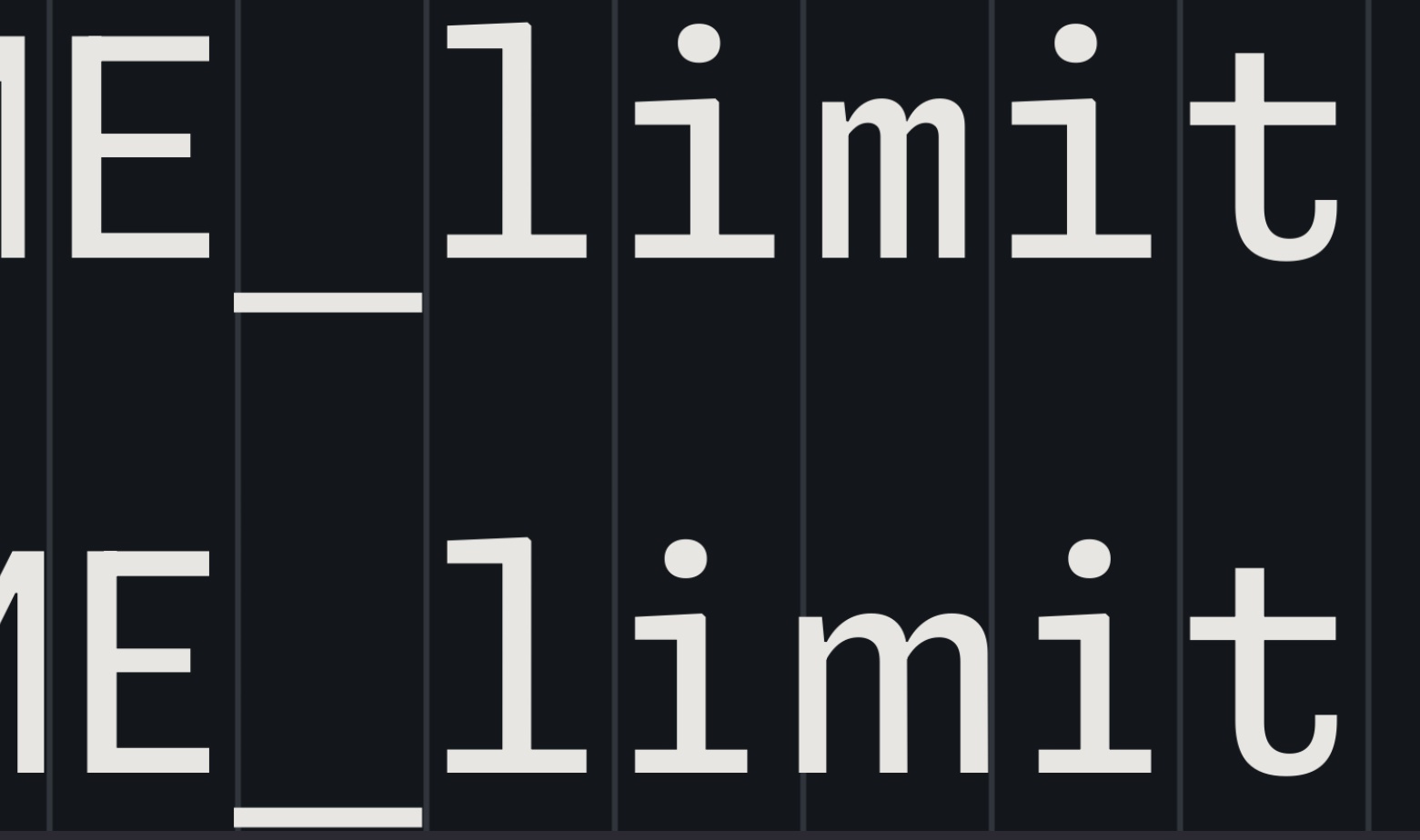
I like all of it, except for that awful “texture healing”. Imagine having words above & below like
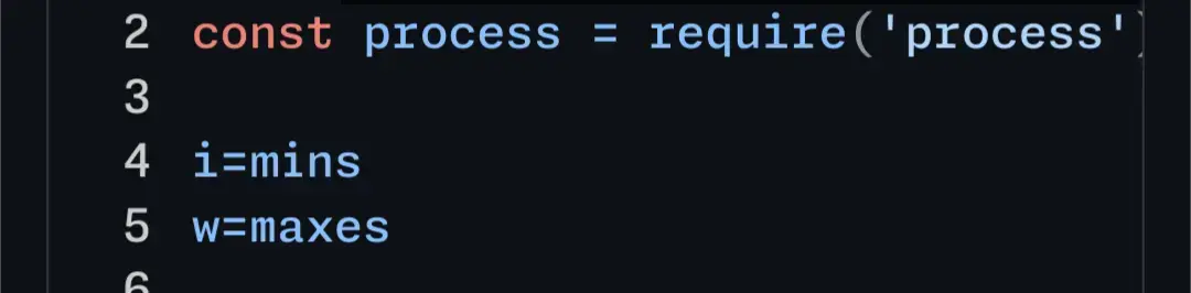
i=mins
w=maxs
But the
m’s just slightly don’t line up because the top one is wider than the bottom one. I’d feel like my editor was gaslighting me 🤢Here’s your code example in the editor. I don’t personally think the difference between the 'm’s is super noticable. But what did strike me a lot more is the difference in height between the two 'i’s in the first line. I think that difference is pretty bad.
It looks like it’s not an actual height difference, but the smaller width makes the second i look significantly smaller than the first, also implying a lower height.
thanks for rendering that! and yeah that height difference is really weird. That almost seems like a bug.
Also Idk if the ='s make the m smaller or bigger.
If the streching is so small as to be unnoticable (and I agree it’s pretty subtle) then I also don’t really understand the benefit.
If the streching is so small as to be unnoticable (and I agree it’s pretty subtle) then I also don’t really understand the benefit.
Typically, the idea behind this sort of design is that it should be unnoticeable. The motivation is that, with other monospace fonts, the differences in character width, along with the inconsistent spacing and line thicknesses are both noticable and distracting. Some of this badness is avoidable, and this is what this font attempts.
and yeah that height difference is really weird. That almost seems like a bug.
I’ve been informed, (and had to double check because I didn’t believe it,) that the two "i"s are actually the exact same height. The first looking larger than the second is an optical illusion. Font design is hard.
They would still line up, wouldn’t they? Or am I misunderstanding how the texture healing would work… Would they not take the same total amount of space?
Each line is the same total length but the “m” in “mi” would be wider than the m in “ma”